Thursday 26 November 2009

Magazine Advert & Digipak final


Wednesday 25 November 2009

Previous cover art from The Thrills


Although two of these album covers are fairly similar, the second one is completely different. This works in our favour as The Thrills don't appear to follow one set theme for all of their cover art. The second one is a little like our idea as it's quite simple and artistic, rather than using a photo of the band like the third one does.

DVD cover art

We finished our DVD cover in lesson today, and it looks a bit like this...

We did make some minor alterations however, such as deciding not to use the image of the man on the back of the case, we put a smaller version on the spine as we felt he didn't quite go with the design, but still wanted to feature him somewhere on the case. We also carried the skyline onto the back of the case, which we thought made the product look more attractive. In the end we went witht the 'cartoony' colour scheme of bright blues, and yellow for the stars and the moon. This made the product a lot more eye-catching and bold.
Next task is to make the inside of our DVD case, which we plan to make fairly simple to carry on the theme of simplicity that has ran through our products. We then need to make our magazine advert which will be fairly similar to the DVD cover to link the products and make each recognisable with the consumer. However the magazine cover will have some more text on it such as the release date of the album and listing a couple of songs on it. We have one more lesson to complete this but hopefully we will finish it all by tomorrow!

Tuesday 24 November 2009

FONTS!


I've narrowed the font of the writing featured on our album to these three. I think it would look better if the font we use on the album cover is the same as the font used on the magazine advert. Not sure which i prefer yet, will talk it over with the group tomorrow :)

Kiss - Love Gun


The first thing i notice about this album cover is the incredibly obvious way in which the genre is displayed. Font, costume and overall presentation all suggests that this CD is quite heavy rock music. In terms of Goodwin's analysis, this album cover definately supports his 'theme of voyeurism' theory. The similarly dressed 'fans' (or even groupies?) are all quite literally at the band's feet, looking as though they really admire the band, and creating a sense of band empowerment. Overall, this album cover is very conventional of the music genre, enabling the consumer to know exactly what they're getting.

Gwen Stefani


In my opinion, the genre of music this magazine advert is advertising is pretty evident in this design. The fact that the singer is featured as the main focus of the advert, combined with elements of luxury and wealth such as the tiara, along with the choice of costume and girl associated colours, all indicate that this is an advert for a pop CD. There is also a small photo of the actual CD album in the bottom left corner of this advert, which features the same image, just zoomed out a bit. This links the advert with the CD in a visually obvious way, so the consumer is more likely to recognise the album and purchase it after seeing this advert. This advert also features quite a bit of writing, listing a few pre-released songs on the album, aswell as the names of the singer's back up singers (Love, Angel, Music, Baby), all to promote the general image of Gwen Stefani and make her music and branding easy to recognise.

The Hotlines


Although the genre of this band isn't primarily obvious, when looking at the various features of this advert, it is easy to narrow down the options. There is no photo of the band, instead it features a retro picture of a woman with a phone, the colours of which have been artistically smudged on the "wrinkled" page. The font matches the retro image the band has demonstrated so far, and creates quite a quirky vibe, one that links them with bands such as the Beach Boys and The Ramones. This gives an idea of what genre the music being advertised may be. The text on this advert is very bold and simple, and also features the band's Myspace URL, which already starts to put the band into a sort of grouping of fairly new bands which gather fans online. The genre of The Hotlines is in fact pop punk, a quirky style of music which uses elements of different already established genres, and makes very unique tracks. I think this advert demonstrates the image they're striving to portray very well.

Morrissey - you are the quarry


This album cover is quite obscure and not directly obvious about the genre of music it is representing. However, the quirkiness of using a lego man to represent the band, combined with the bright and playful colours suggest that the music is not going to be heavy metal, much more of a softer sound. The band name and album title aren't the main focus of this cover, yet the overall simplicity of the design does make them one of the first things you notice. This design shows hints of Michel Gondry's work, bringing out the childishness in simple things, such as an album cover in this particular example.

The Strokes - This is it.


This album cover is very simple, and uses desaturation instead of colour which does help the design to stand out more. The image is quite controversial, while also very intriguing and different. The simplicity of the band name and album title fits with the theme of this cover, which i believe to be enigmatic. The genre of music that this album is representing isn't at all obvious, which provokes people to listen to the music rather than dismissing it as a certain genre they don't particularly like.

Monday 23 November 2009

digipak ideas


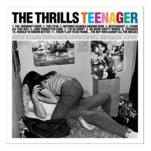
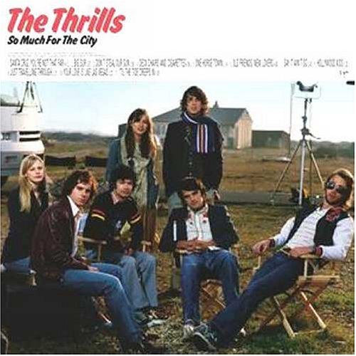
These are the two ideas i had for DVD covers of our album. I much prefer the second one as "The Thrills" is a lot more noticable and the illustration is much more simple and depicts 'saturday night', which is what we've tried to make our video do. If we went ahead with the second design i would probably make the picture of the guy on the back of the case a bit bigger so the band's image is still maintained. I'm not sure about the colour scheme for the case, but narrowed the choices down to two ideas...

1. A sepia colour scheme to continue the music video's theme, with the title and the guy on the back in a different, more vibrant colour.
2. Bright cartoony colours to show the animation aspect of the video. Navy skyline, slightly lighter blue sky and yellow lettering for the writing. This theme will obviously be carried on on the back.

If time allows, we may have to try out both colour schemes to see which is more effective and complements our video.

digipak ideas


digipak examples


Thursday 19 November 2009

Initial Ideas for DVD album


  • skyscrapers
  • Night sky
  • Stars - spelling out " the thrills"
  • Clouds

Wednesday 18 November 2009

Peer Goodwin Feedback

fits with characteristics
the different style of video was good with the animation,
the humor was enjoyable and well thought out. storyline linked well with animation and flowed well.
relationship with lyrics and video visuals were obvious giving images that illustrate in different ways what is being said in the song.
there is a relationship between music and visuals shown, particularly the part of the guitarist as he is strumming along with the music, also how video drawing move along with music well.
as it is an animated video there is no obvious notion of looking as there are no artists or people present on the screen. however, there is symbolic voyeuristic treatment of the female body when the prostitute is shown.

Thursday 12 November 2009

Change Of Plan...

Our original plan for our animation was to shoot some real life footage to mix with the animation. We were going to have a real life character at the begining of the video in a house and as the character leaves the house the video would change into animation. We were going to do the same with the ending where we would have an animated character walk back inside the house and change back to a real life character. However we have now decided not to do this as we feel this will direct the focus away from the animation, and the animation will be more effective and have more of an impact as a full animation. We also dont want to over complicate the animation as its simplicity is what we feel makes it effective.

Monday 9 November 2009

Process - Editing & Footage

At the moment we are currently editing our footage. We are cutting the footage to match the music. There were some parts in our footage where shadows are present from the camera and the people in the background; We tried to get rid of the shadows by putting filters on the footage but it did not work so we have decided to film it again.

Thursday 5 November 2009

Filming On Tuesday

On Tuesday we will take the camera out to shoot our only piece of real-life footage. We will shoot the main protagonist in the house walking towards the door, opening it than walks outside. Everything afterwards than immediately turns to animation.
Towards the end of the music video the protagonist than walks back inside the house and everything returns back into real-life and the video finishes.

Wednesday 4 November 2009

Filming

We came up with an alternative but similar method of capturing our footage instead of using a stills camera where we found that it was difficult to get the picture in the same position each time. Where as when we use a camcorder we can film it in one go and then cut the footage into stills and get the the exact still we want for example when we wanted hearts to appear on one by one; With a camcorder we left the camera rolling as we placed them on one by one but with a stills camera we would have needed to place one on then take a picture then place another one and take another picture which would have taken longer to do.
When making some of our characters we used photoshop to turn a photo into a animation by using a pen tool. It was difficult because we had to make sure we got every little detail .

Monday 2 November 2009

feedback reaction and plan for next few weeks.

We were very happy with our feedback, even though there wasn't much to judge. We've been made more aware of things we need to pay more attention to such as angles and camera movement, and generally showing more variety in our footage.

Over the next 2 weeks we plan to spend the majority of the time editing our footage.

wednesday 4th: editing footage. completely finish off props.
thursday 5th: editing footage.
monday 9th: filming final parts. if anything needs to be filmed again, we can do it then.
tuesday 10th: take camera out overnight to film real life footage.
wednesday 11th: editing footage.
thursday 12th: finishing off last of the editing.

teacher feedback.

Comments on the style of our video was "a quirky and effective approach to the genre of music" which we liked. Camerawork was also praised, but transitions need to be done. We was told that we need to treat the animate like cinematic footage, meaning include a variety of angles, movement and distance, which is something we feel we definitely need to be more aware of. Also, to fit in with our genre's conventions, we should probably include a few close-ups of our main characters face to get some expressions. Overall, feedback was good, but it has definitely highlighted aspects we need to focus more on when editing and doing our final bit of filming.

peer feedback.

Despite our rough cut being about 5 seconds worth of footage, feedback was generally positive. Most said our camerawork was good as was the artwork, however aspects such as transitions and use of conventions couldn't really be judged as we haven't properly started editing yet, and haven't even put the song up. The comments on missing stuff was obviously extensive as we haven't yet got a sequence together, but we will get started on that this week.
 
© 2009 GROUP 28 - Music Video 2009/10. All Rights Reserved | Powered by Blogger
Design by psdvibe | Bloggerized By LawnyDesignz