Editing The Commentary
The hardest thing we found about editing our footage was cutting it down to around 5min. We had a lot of footage so we had to decide what we deleted and what we kept. We also wanted the commentary to be organized in the order of the question so Q1 and the beginning of the commentary and ending with Q4. We started the commentary with footage of the beginning of the music video and then the music fades to quite and we start talking, at the end of the commentary the talking fades and the music starts and the end of the music video is shown. To make it visually interesting we had a mixture of us talking/discussing and then some footage/pictures shown whilst were talking that relate to what were talking about e.g clips from the video, pictures of ancillary tasks (q2), screen-shots of final cut and websites we used (q4) etc.
Planing & Filming the commentary
Thursday, 10 December 2009
Media evaluation
The genre of our band The Thrills are a 1960’s indie- rock band from Ireland. Instead of a performance based media product like most indie-rock bands we decided to challenge the conventions by making it into a animation; Instead of a stereotypical indie-rock band music video we wanted something interesting and fun. In most of the Thrills music videos they tended to have a sepia filter on them, so we decided to use this effect on our music video to give that 1960’s feel. To add to the 1960’s feel we used mise - en scene to help us for example a guitar, Bob Dylan a ‘Vote J.F Kennedy poster’. Also in most indie-rock music videos the camera is mainly focused on the lead vocalists but we challenged this by focusing on the main animated character. We decided to film our product on a camcorder instead of using istopmotion which was our original idea. By doing this we could intentionally add shadows and have shaky camerawork to create the childish theme which we had intended on doing. However the song talks about ’love’ ’sex’ and ’hate’ which is an opposite theme to our video. We were hugely influenced by Melpo Mene’s ‘I Adore You’ which uses a hand made drawings of characters like we do.
How effective is the combination of your main product & ancillary texts?
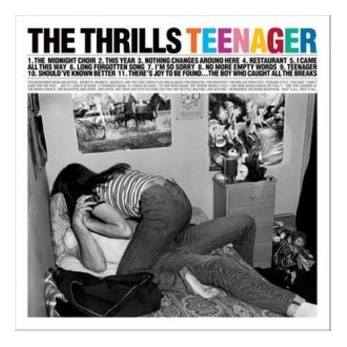
Our ancillary texts and main product complement each other very well. There are three parts to the ancillary products: The main part is our media product which is a animated music video for The Thrills 'Saturday Night’ . We did a DVD cover for the album and a magazine advert as well. We did the DVD cover and the magazine advert a bit differently to our music video but we did still do a cartoon theme just slightly different; The DVD cover is a blue night skyline with shining stars and a moon in the corner. We used the same look for our magazine advert so when the consumers see it they can link the two texts together ( branding our products). The DVD cover and the magazine advert have the same colour background, font etc. except for the information on them are slightly different; The DVD cover has the song lists on the back but the advert has recommendations from music magazines - NME ‘Album Of The Year’ also the release date. The main product and ancillary texts are both simple showing consistency within our products.
What have you learnt from your audience feedback?
The first feedback was about our blog; Telling us how our blog contained the right elements and that we had done a lot of research and that they could see the links between the bands that we had decided to research as well. Also they told us to be careful when making our characters not to make them to unrealistic so that they can understand the story behind the song. Since we were doing an animation for our rough cut we did not have a lot of footage but everyone still gave a positive feedback and encouraged us; They also told us to add more transitions in and also needed to add in the song. Our teacher‘s feedback was very useful she told us to concentrate on different camera angles and various shot types. Our teacher also told us that our video was ‘a quirky and effective approach to the genre of music'which was good because this is what we wanted the video to be like. People also commented saying how our visual relationship with the lyrics was very good because the visuals were telling what the lyrics were saying in different ways, but everyone could understand what it meant. They also told us that our storyboard was very clear and that they could see what we were trying to achieve and that it will turn out very good if we manage to do everything.
How did you use new media technologies in the construction & research, planning & evaluation stages?
We used many various different new media technologies for the construction, research and planning our media product. To construct our video we used the search engine Google and Wikipedia to help us research about The Thrills to see what genre they were and when they were formed and just general background information to give us a sense of what kind of a band they are. Google images also helped us find the images of The Thrills and also helped us search for examples of digipaks. We used Myspace to contact the band for their permission to use their song ‘Saturday night’ but they did not reply. Also we used YouTube to look up videos which we could use to give us inspiration for our video also to look at some of the Thrills videos so we could analyse their style; Also we uploaded our music video on YouTube so everyone could see it so that we could get feedback from the comments. iTunes was used to import our music, once we had filmed on a camera with a tripod to hold the camera in place, finalcut was used to edit the footage. We tried to cut the footage to the beat of the drums. Powerpoint was used to help plan our product, we made a pitch and presented it to our classmates and they were able to tell us what they liked about our ideas and what we could change. Also the our blog from Blogger helped us plan because what ever we came up with we put it on the blog as well as ideas and what we did for each lesson; We were able to see the process and the progress of our music video. Since we had to make all our props Photoshop was used to create some of the characters used in our music video; We did this buy using the pen tool. Dafont was used whilst we were making the texts for the DVD covers and magazine adverts.
Media Evaluation
In what ways does your media products use develop or challenge forms and conventions of real media products ?
The Thrills are a indie/rock band originating from Ireland. They are inspired by the 1960s and include this in their previous videos. We then went on to look at other indie/rock bands and their videos and after analysing some videos and noticing that most music videos are performance based lead us on to think how we could challenge this convention of videos.
We wanted something different and quirky which led us to look at Michel Gondry's work. He made a video for The White Strips but it was a Lego men animation, we really liked the idea of making a different style of video and went on to do more research. We looked at Melop Mene - I Adore You, a completely hand drawn animation and it challenge normal conventions but also used them still use different shots and camera angles.
We decided to go with hard drawn to make it stand out and different to other indie/rock band videos.
Originally we were going to use Photoshop because that would of made it stand out from other animations as well as other music videos.
With our group making a animation it made it easier to get the visuals and lyrics to match up and this is a normal convention in other music videos but we added a twist to the way we made it by putting the childish edge to our drawings.
We had to keep the props and background simple and plain so that they would be easy to re-make if anything happened to them and also because we needed to make it look 1960s style and we did this by adding filters, basically by keeping this 1960s style theme that The Thrills following its a form of them and their image. We included some famous icons from the 60s such as Bob Dylan and the love he had for his music which tide nice in with the lyrics & also President Kennedy.
Even though we challenged and didn't use the normal conventions of a music video in some ways we did use the conventions and challenge them at the same time. However the childish and quirky way we made our video defiantly challenge other media products.
2.
How effective is the combination of your main product and ancillary products ?
The combination of our music video and the ancillary products are effective in different ways.
Our main product - music video, we created a different quirky animation with a 1960s influence running throughout. The video is very plain almost dull colours but we need to create the sense of the 1960s so we put a sepia tone over the footage. Throughout the whole video there are no references to the band or images at all because we didn't want to get into the performance based music video. However our Ancillary products are different but still has our childish quirkiness to them, the Digipak was a simple night sky reflecting the name of the album "Saturday Night". There is a city scape skyline with bright bold stars and a moon, this is a complete change to the colour choices in the video. The font chose to be the title and information was bold and seen straight away and we used the same font on the Digipak and magazine advert which linked them nicely but then also there are other things that link the two products together. We used the skyline, font, moon, stars etc. on both of the products.
I think that by making these products so similar will help people to recognise the band and there style but also show they are different to other indie/rock bands. This to me is an effective way of making people remember and recognise our products because the more you see something or a similar object along the same lines it make the consumer think about our product.
3.
What have you learnt form your audience feedback ?
Throughout the making of our music video we were given feedback from and peers and teacher and it became very useful because it would so us where and how we were going wrong.
Our first real feedback blog was when we had to so our rough cut video to our peers, however , even though we only had 5 seconds of footage we got a good response, which made us believe in ourselves even more. Although our rough cut couldn't be properly judged because we hadn't started editing or anything yet our peers were very nice and complimentary.
We also got feed back from our teacher which also was a very useful and worth while thing because we got told things that we most likely wouldn't of thought about ourselves such as our camera work and how we needed to treat it as a actual cinematic piece of work.
The peer feedback using Goodwin's Theory was very helpful to know exactly what our peers thought of our video. With the Goodwin's theory feedback it all turned out to be good about our editing, camera work & Music and visuals.
Music and visuals was hard for us to get right while filming and then to get good feedback about how people liked the movement of the characters and other props. The last feedback we got was about the whole video but the main point that stood out to us was that we had no reference to the band at all and we never even thought about how we hadn't referred to the band until some one mentioned it.
4.
How did you use new media technologies in the construction and research, planning and evaluation stages?
We have used many different new media technologies throughout the making of our music video. In the planning stages of this project we used the internet, Google to find the lyrics and find out more about The Thrills themselves. We had to contact the band to check we could make this video and use there song, for this we used MySpace.com the on-line social networking site.
We used Wikipedia to get the basic information on The Thrills and this is when we found out about the 1960s influence and then to get more of a feel for what The Thrills do with their previous videos and how to get this classic 1960s feel.
In order to get started we had to get the music track from the CD on to the MAC, to do this we used iTunes to get the track and then converted it into a suitable file so that we could us it in Final Cut Express. Next we had to get our first ideas together to show our class and we used PowerPoint for this and then used slideshare a website which allows you to share you PowerPoints.
For some of our characters in our animation we used Photoshop and printed them and then filmed.
Anything that was filmed on the camera was then captured it to Final Cut Express and edited, it came to making our rough cut and we had to convert the Final Cut Express file in to a Quicktime file which was then uploaded to YouTube and also to blogger which is where we recorded all of our progress.
After the rough cut we had to carry on filming and capturing until everything was filmed and captured into Final Cut Express it was time to edit. When this was all finished we had to convert it again and upload it to Blogger & YouTube.
Our Digipak & Magazine advert were made all in Photoshop, however we used Google and Wikipedia to research and get the pictures we needed to use and help us create and desired finished products.
Media Evaluation
Our media product mainly challenges the forms and conventions of real media products but also uses them in some way.
One way in which our product uses the forms and conventions of real media products by The Thrills is that we have carried through the 60’s style of The Thrills in our music video. Our animation is of a Saturday night set in 60’s America with typical 60’s atmosphere. For example the 60’s disco, Bob Dylan playing the guitar and the JFK poster - these are ways in which our animation uses the typical conventions of The Thrills. Also parts of the mise-en-scene are similar. Sepia filters are used a lot in “The Thrills” music video and is used in our video as well to give that same 60’s appeal. Also the costume is similar as well as The Thrills have very 60’s clothing and even though our characters are basic drawing we tried to give them that same 60’s look.
One way in which our product challenges the forms and conventions is that it’s an animation with a childish look. When we researched through The Thrills past music videos we could see that they were largely performance based with the camera always directed at them. We challenged these conventions and went with an animation as we thought it would be very effective with the type of song. The type of animation we went for has a child like look that also goes against the lyrics of the song. The song talks about love hate and sex on a Saturday night that are very adult things, yet the video has a child like look.
We also challenged the forms and conventions by using camerawork and editing. The camerawork in indie/rock bands are normally largely focused on the band/artist singing with a few shots of their location. Our music video challenges this in that the artist is not in it at all, so our main focus is on the character within the animated world and the animated city he’s in. Also as this is a basic animation, the video is a lot more static than a typical indie music video where they might be moving around a lot.
One way in which we did use the forms and conventions in camerawork is that we had variety of shots in our video. Long shots zoom in, establishing shots and close ups of the main character, minor characters and buildings. We also conformed to the conventions of editing in typical indie/rock music video as we used simple transitions between different scenes in the editing – We used mainly cuts to go from one scene to another.
2. How effective is the combination of your main product and ancillary tasks?
The combination of our main product and ancillary tasks is effective in different ways. Our main product is an animated music video of the song “Saturday Night” by The Thrills. We had to make an album featuring the song and a magazine advert advertising the album. Our album cover is of a night skyline with a moon and stars above. It has a colourful and cartoon feel to it which works well in conjunction with our main product, an animated video of Saturday Night. Also our magazine advertisement uses the same look as our album cover so it’s easily recognisable to anyone who sees the advertisement to find the album. The magazine advert uses the rule of 3rds for easy recognition. At the top it has moon, stars and ‘The Thrills’ on it (in the same way the album does) In the middle there are recommendations from music magazines such as NME ‘Album Of The Year’ to make readers want to go out and buy it. At the bottom we have the record label Virgin Records, release date and same sky line which are used in the album cover. Both the magazine advert and album cover share the same colour scheme making it colourful (blue backgrounds which represent the sky) and again recognisable.
Our main product and our ancillary also have an effective combination by using shapes, colour, theme and motif. The shapes used in the main product and ancillary tasks are similar in that they are both very basic. Our music video mostly uses basic shapes such as squares for the buildings (with a small triangle top) and the props are very basically drawn with simple lines (basic people, clouds, people in nightclub was just drawn as a shade etc) The poster and magazine cover are both rectangular shapes. The colours used in the main product contrast to that of the colours used in the ancillary. The music video used the kind of peach, beige, grey and creamy colours to create a simple and calming look which contrasts to the ancillary tasks which both use bold colours such as yellow, blue and black – This makes the album and magazine advert stand out and get noticed by the audience. The music video and ancillary also both share a similar theme in that there both in a childish/simple world, for example the yellow moon and stars and “The Thrills” written in white behind a blue (sky) colour and city skyline at the bottom, the child like world in the music video is that city – The motif of our video is this theme of innocence and the 60’s look given across throughout the music video. Both our ancillary tasks (magazine advert & album) and music video feature no representation of an artist, this helps keep the effect that we wanted in that this is a separate world that the audience can be a drawn in by.
3. What have you learnt from your audience feedback?
Throughout our project we were given feedback from our peers and teacher to help us improve on the work we had done and see what we were doing right/wrong.
Our peer feedback for the rough-cut was relatively positive despite our rough cut being about 5 seconds worth of footage. Most said our camerawork was good as was the artwork, however aspects such as transitions and use of conventions couldn't really be judged as we hadn’t properly started editing yet, and hadn’t even put the song up. The comments on missing stuff were obviously extensive as we hadn’t yet got a sequence together. We learnt quite a bit from this feedback as even though it was 5 seconds long it helped any uncertainties we had about the artwork (maybe not suitable for the song) pass on which we were happy about.
Our teacher comments for the rough-cut were quite mixed. We had positive comments on the style of our video "a quirky and effective approach to the genre of music" which we liked. Camerawork was also praised, but transitions need to be done. We were told that we need to treat the animate like cinematic footage, meaning include a variety of angles, movement and distance. We learnt a great deal from these comments as treating the animation like a cinematic footage was something we defiantly needed to be more aware of and are very important in creating an effective animation. To fit in with our genre's conventions we decided to include a few close-ups of our main characters face to get some expressions. Overall, feedback was good, but it has definitely highlighted aspects we need to focus more on when editing and doing our final bit of filming.
Throughout out the whole task we posted blogs on how we were getting along, our plans, designs, research etc. Midway through we had a peer blog feedback. They said our research into similar bands were detailed with lots of visuals and good analysis – We were happy with this and made sure we kept it up throughout. They also commented that our storyboard is clear and detailed and our initial ideas were very good. They said that we had good photo tests but needed to add more video test footage – We learned a lot from this as we realised we needed a lot more visual practice for the animation.
After we had finished the final cut we had a Goodwin Peer Feedback. Our Goodwin Analysis feedback was very positive. They said that it the video fits with the characteristics and the different style of video was good with the animation, the storyline linked well with the animation and flowed well. They also commented on how the relationship with the lyrics and visuals were obvious giving images that illustrate in different ways that is being said in the song- This is something that we were trying to carry out throughout the video, to visually display the lyrics of the song to create a vivid image. They also commented on the relationship between the music and visuals shown, particularly the part of the guitarist as he is strumming along with the music, also the drawing moved along with the music well. As it’s an animation we wanted the audience to get inside the animated world so we wanted to create a relationship between the visuals and music in order to do this. They lastly commented on how there no obvious notion of looking as there are no artists present on screen, however there is a symbolic voyeuristic treatment of the female body when the prostitute is shown.
4. How did you use new media technologies in the construction and research, planning and evaluation stages?
We used many different kinds of media technologies in the construction and research, planning and education stages of our products. In the planning of our main product we used the Internet. Firstly we had to contact our artist to ask them if we could use there song in our video. To do this we used MySpace an online social network, where we went on there page and left a comment.
We used Google Search Engine and wikipedia (online encyclopaedia) to research into the bands style and genre (rock/indie). We used Youtube which is an online library of videos uploaded by other people to look at The Thrills past music video’s and we could see from these that a 60’s American style was obvious throughout most there videos such as there clothing, hair etc Also some had special filters (sepia) to achieve the 60’s look this helped us to make out music video visual effective. Our video is called “Saturday Night” and is of a 1960’s Saturday night. To get inspiration for our animation we used Youtube again. We looked at many different kinds of animation until we decided on a particular style we wanted to go for and thought would be most effective for our music.
To import our music form the CD to the computer we used itunes. Once we had our ideas we had to present them to the class. For this we used Microsoft PowerPoint and used slideshare to put it on our blog. Using PowerPoint allowed us to easily display and show our ideas to the class as we could have different slides for different topics (style, ideas, album cover etc) we got images to help us show our ideas from google images.
To create some of our characters in our animation we used Adobe Photoshop and printed it on photo paper. To film our animation we used a camcorder and a tripod to keep the camera in the same position throughout and perfectly still. To edit our video we used Final Cut Express which is video editing software. To create our two ancillary tasks we used Adobe Photoshop to create the magazine cover and digipak. We got the images for the magazine cover and digipak from Google images and screenshots form our animation. All the fonts from our ancillary tasks came from a website called dafont which has a huge range of different fonts, we used dafont so we could get the fonts that would be most effective.
All this technology is accessible to nearly everyone and can have a huge impact on an amateur filmmaker. This technology such as Final Cut Express and Photoshop can help amateur filmmakers make their work effective and professional and leaves them to do whatever they want. Also the new online technology can really help them get their work noticed and watched by people all over the word. By using YouTube (which allows anyone to upload videos) amateur filmmakers can upload their creations on the website so anyone around the world can see it. This is what we did with our finished music video, we uploaded it on the Longroad media channel on YouTube and now it can be watched by anyone – People who watch the video can also give you feedback by rating the video (1-5 stars) or leaving comments under the video.
evaluation questions unfinished.
In what ways does your media product use develop or challenge the conventions of real media products?
The genre of The Thrills is indie rock, originating from Ireland, but with an added hint of 60’s American culture influencing the band’s lyrics and video’s. We decided to portray this genre in a quirky and not necessarily conventional style, opting for animation instead of the band’s favoured performance based videos/ This kind of went against what is seen as typically ‘indie’, therefore slightly challenges the genre’s established conventions. Although we was going against the traditional indie video format, we felt that it still fit within the genre as it’s becoming more and more about creating the unexpected, and mixing indie rock music with sometimes quirky and humorous video’s, which was our intentions with our own product. To further this quirkiness we decided to use a video camera to make the animation as oppose to our original istopmotion plan. This enabled us to use effects such as shaky camera and intentional shadows to fit with the childish/amateur theme we were trying to depict. The mise-en-scene used in our video carried on this style, and by using simple colours like creams, browns, black and reds, we was able to add to the overall simplicity of our product, along with the childish drawings we used to create our various scenes, largely inspired by Michel Gondry’s work on music video’s such as White Stripes – Fell In Love With A Girl, which uses Lego animation. We were also influenced by the video ‘I adore you’ by Melpo Mene, which used a ‘hand-made’ visual style, and built on what is sometimes known as the ‘cute factor’. With our video following a similar style to this, it provided quite a contrast between visuals and lyrics as although according to Goodwin’s theory we did include an amplified relationship between visuals and lyrics, the childish/innocent drawings clashed with the images of prostitutes and lyrics such as “is this what they call sex?” and “dry-humping on dance floors”, causing quite an indie-inspired, odd relationship between the music and the visual style of our video. The mise-en-scene in our product worked well with the genre as we made props such as; a guitar, a Bob Dylan character, a nightclub, a record player with a vinyl, and a ‘vote for J.F. Kennedy’ poster. As well as providing a reference to 60’s America, the poster also added a subtle political allusion, which is a rare convention in indie videos, but evident in 80’s indie band, The Housemartin’s, who used music to express their strong Marxist views. The most extreme example of using music to illustrate political preferences I found is the video ‘Megalomaniac’ by Incubus, with critics describing the video as a “barely veiled condemnation of George W Bush” and essentially targeting corrupted politics. As previously stated, The Thrills are largely inspired by 60’s America and we tried to incorporate this as much as possible into our own video by using iconic references from this era such as films like Psycho and Lolita, on the television screen in one of the scenes, as well as various images of Bob Dylan and an Iron City beer bottle. This kept our product in tone with previous Thrills’ videos, and added to the whole branding of the band. With editing, we mostly cut our footage to the beats of the music, a typically Indie feature, and also to re-enforce the link between the music and the visuals. Overall, although our video may have challenged typical conventions of Indie music videos in certain parts, doing this is what makes an Indie video stand out which is what the genre is all about.
How effective is the compilation of your media product and ancillary tasks?
Our video, magazine advert and DVD cover works well together in that they all share the theme of animation and visual simplicity. Also, just like the visuals on our video match the lyrics, the image on our ancillary tasks matches the title of the album. For example, the title is ‘Saturday Night’, therefore we used a skyline silhouette, and a night sky with stars and a moon, demonstrating a Saturday night. However, our ancillary tasks use a slightly different animation-look style than the video in that it’s a little more ‘cartoony’ and uses more bold and vibrant colours such as blues and yellows in order to make our product more eye-catching. Also, we made our DVD cover and magazine advert very similar, using the same background and fonts, just with different information on each product in order to create a strong, recognisable branding for the album. We haven’t used any photos of the band on our album as there aren’t any in our music video. The band is mainly represented by the animated guy in our video who we made part of our album by putting an image of him on the spine, creating a link between the products.
What have you learnt from your audience feedback?
The first feedback we received was about our blog; how our planning was going, what research we had done into similar bands, what test footage had we done so far, and how is our original music video concept. This feedback was generally very positive, and we were told that we had a good balance of text and images on our blog. Our concept was also praised and described as “innovative” and “imaginative”. The only criticism we received was that we needed to make sure that our “drawings look realistic enough to recognise and that they move smoothly for understanding the story behind it”. This was definitely something we needed to bear in mind, and made us more alert when drawing our props and making sure they were simple and clear to the audience. After making our storyboards we then got to work on filming, resulting in creating a rough cut. As we was doing an animation it took us a lot longer to film our footage than some other groups so there really wasn’t much to judge. However, we were informed that our artwork on the props was good, but we needed to add the song to the sequence and start thinking about transitions. Our teacher feedback included comments on making sure that we treat the animate like cinematic footage and pay more attention to angles, movement and distance, and basically making sure we included variety in our camerawork. This was something we worked on during our second week of filming, and made sure that we varied our camerawork. On a positive note, our style of video was described as “a quirky and effective approach to the genre of music” which was appreciated as this was the effect we was aiming for. When we had finished our entire video we received feedback based on Goodwin's theory. Here we were told that our "humour was enjoyable", the "relationship between lyrics and video visuals were obvious giving images that illustrate in different ways what is being said in the song", and "there is a voyeuristic treatment of the female body when the prostitute is shown". All of this feedback was appreciated, and we were made aware of things our video seemed to do that we never even intended (voyeuristic view of the prostitute). All this feedback was positive so we were quite happy with what we had produced. Our final feedback was on our ancillary tasks. Feedback included "good use of indie inspired typefaces", "strong relation with the final media product" and "no images of the band". However this last comment may be true, but having no image of the band was definitely intended as based our album on the video which represents the band as the one animated man, featured on the spine of our DVD cover. All feedback received during this product was very constructive and made us aware of elements that we had done well and other things that we needed to work more on and improve.
How did you use new media technologies in the construction and research, planning and evaluation stages?
To plan our music video we used Google Search engine a lot to research The Thrills and see what kind of band they were, what inspires their music/videos, and the band’s overall image. Online encyclopaedia, Wikipedia came in handy for this, as did video sharing website Youtube. On Youtube we were able to watch The Thrills music videos to gain an understanding of a signature style which is a constant theme in their videos and image. This is when we noticed a strong 60’s American influence, largely demonstrated through the sepia filter on some of their videos, 60’s intertextual references in their visuals as well as song lyrics, as well as the band’s choice of costume. All of this information was then put onto our planning blog, by use of blog publishing system, Blogger. On here we published our pitch which was done on a PowerPoint presentation as we felt it was the most effective way to pitch our ideas for our music video, explain why we have decided to do certain things, and use visual examples that illustrate different elements of our media product. Once we had planned our concept and pitched it to the class, we begun to make our product. As we chose to do an animation, we had to make all of our own props. Most of these were made simply with paper and pencils, but some were made on Photoshop. We took some photos of these props with a stills camera and uploaded the photos to Blogger. We then filmed our animation using a camera and tripod. Although originally our plan was to use istopmotion in our video, we eventually decided against it as we found it too time consuming and thought using a video camera would help us achieve the overall effect we was aiming for. We uploaded our footage to Final Cut as we went, and eventually started to put the visuals to the music in a sequence. We tried to cut the music to the music beats as much as possible. We then added a sepia filter to all of our footage in order to link the product to previous Thrills videos. We also sped up the footage in order to make our animation go faster. Finally, we uploaded our video to Youtube and begun working on our ancillary tasks. To make our DVD cover and magazine advert we used Google Images to get the images we wanted to use, before modifying them on Photoshop to make them fit with our animation style specifications. We also used the website Dafont, which is an archive of freely downloadable fonts, for the text on our products. All of these new media technologies have helped amateur film makers by making it easier for them to access online media, and create their own products using programs such as Final Cut Pro that’s targeted at independent film makers so not as complicated to use as other programs like Avid’s Media Composer.
Wednesday, 2 December 2009
- strong relation with the final media product (the video)
- good use of indie inspired typefaces
- magazine add is obviously linked with digipak
- nice and simple
negative
- inside of case is to similar to outside
- no images of the band? (did you mean to do this)
- poor combination of different resolution images


Wednesday, 25 November 2009
Previous cover art from The Thrills

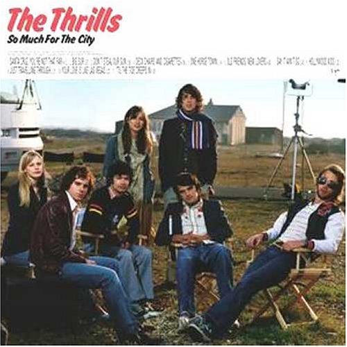
Although two of these album covers are fairly similar, the second one is completely different. This works in our favour as The Thrills don't appear to follow one set theme for all of their cover art. The second one is a little like our idea as it's quite simple and artistic, rather than using a photo of the band like the third one does.
DVD cover art

Tuesday, 24 November 2009
FONTS!


Kiss - Love Gun

Gwen Stefani

The Hotlines

Morrissey - you are the quarry

The Strokes - This is it.

Monday, 23 November 2009
digipak ideas

 These are the two ideas i had for DVD covers of our album. I much prefer the second one as "The Thrills" is a lot more noticable and the illustration is much more simple and depicts 'saturday night', which is what we've tried to make our video do. If we went ahead with the second design i would probably make the picture of the guy on the back of the case a bit bigger so the band's image is still maintained. I'm not sure about the colour scheme for the case, but narrowed the choices down to two ideas...


Thursday, 19 November 2009
Initial Ideas for DVD album

- skyscrapers
- Night sky
- Stars - spelling out " the thrills"
- Clouds
Wednesday, 18 November 2009
Peer Goodwin Feedback
the different style of video was good with the animation,
the humor was enjoyable and well thought out. storyline linked well with animation and flowed well.
relationship with lyrics and video visuals were obvious giving images that illustrate in different ways what is being said in the song.
there is a relationship between music and visuals shown, particularly the part of the guitarist as he is strumming along with the music, also how video drawing move along with music well.
as it is an animated video there is no obvious notion of looking as there are no artists or people present on the screen. however, there is symbolic voyeuristic treatment of the female body when the prostitute is shown.
Thursday, 12 November 2009
Change Of Plan...
Monday, 9 November 2009
Process - Editing & Footage
Thursday, 5 November 2009
Filming On Tuesday
Wednesday, 4 November 2009
Filming
When making some of our characters we used photoshop to turn a photo into a animation by using a pen tool. It was difficult because we had to make sure we got every little detail .
Monday, 2 November 2009
feedback reaction and plan for next few weeks.
Over the next 2 weeks we plan to spend the majority of the time editing our footage.
wednesday 4th: editing footage. completely finish off props.
thursday 5th: editing footage.
monday 9th: filming final parts. if anything needs to be filmed again, we can do it then.
tuesday 10th: take camera out overnight to film real life footage.
wednesday 11th: editing footage.
thursday 12th: finishing off last of the editing.
teacher feedback.
peer feedback.
Thursday, 15 October 2009
Different ways of creating animation

Whilst exploring different ways of creating animation, i came across this website on the internet. It was a bit difficult to use at first but it the end it was very simple to use. Even though it was not the style of animation we wanted to use, it was still interesting to have a look at.
http://www.fluxtime.com/animate.php
Wednesday, 14 October 2009
filming.


Wednesday, 7 October 2009
Visual style ideas


These images are from the video 'I adore you' by Melpo Mene. I like the style of this video as the drawings are fairly simple and almost child-like, but it also manages to appear sophisticated and professional. I like the way the buildings in the first image have been drawn and might try to re-create something like that in our own video. Also, in the last image the background looks like it might be a black and white photo of grass, with some kind of effect on it making it not as clear, this is again something we could use in our video.


These images are from the video 'Point of view' by DV Boulevard. This is a different type of animation to the first video as it's 3D. This allows the visuals to be less precise and more basic. I like the fact that everything's made out of cardboard in this video, and the way they've created the street. This is something we might incorporate into our own product.
We've decided to make the visual style of our video fairly simple and childish-looking. We hope this will come across quite artistic and and inspired by Michel Gondry's work which uses many childish references as his signature style.
Response to blog feedback
Blog Peer Feedback
The detail in your post is very good, with lots of great visuals and good analysis.
2. Storyboard and Timelines -
Your storyboard is amazing, really clear and very detailed. Your initial ideas are great and something to be proud of.
3. Test Footage -
More video test footage could be added but your photo blogging is very very good and really great use of effects.
4. Concept of the Video
really good and very imaginative. If you get this done properly then it will be awesome!!!!!
Group 27 Feedback
-The storyboard is extremely detailed as is the research, it shows that the work has been thoroughly planned and well explained.
-The research on the similar bands is also really detailed and we can clearly see the relations from the previous plans and the concept ideas.
-the concept of the video is clearly laid out and shows innovative design ideas, and true understanding of the task.
- the blog looks very visual and doesn't bore easily, and there is a good balance of descriptive visuals and written visuals.
- All we can say is to be careful that the drawings and puppets look realistic enough to recognise and that they move smoothly for understanding of the story behind it.
9/10 good luck! hope it all goes well.
: )
t1 27-matt, katie and harriet


